IKONOLOGY’s 3 Way Design – A Modern Tarot – Oracle, Solitaire, and Poker
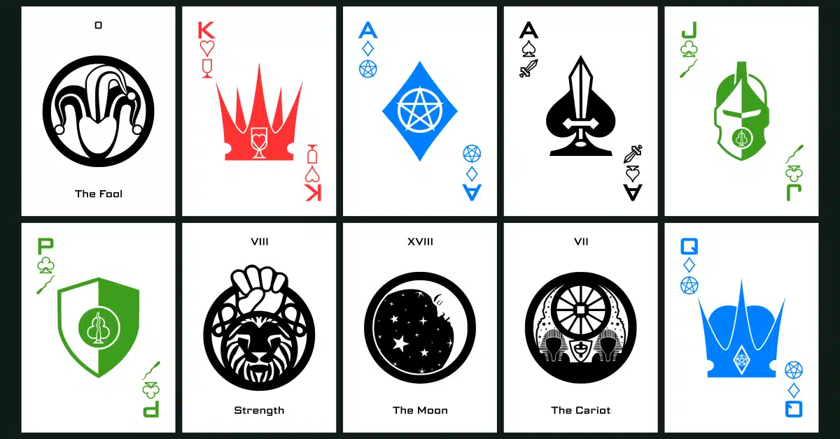
Table of Contents
Behind the Design: I Turned Tarot Into Icons — And Accidentally Built a Poker Deck Too
We live in the most icon-literate era in human history, and most of us never think about it.
Look at your phone's home screen right now. A little camera shape means camera. A gear means settings. A speech bubble means messages. You don't read those icons — you recognize them, instantly, the way you recognize a friend's face across a parking lot. That's the whole point of an icon: it hands you a complex idea in a shape simple enough to grasp in a fraction of a second, with zero cognitive "gas" spent. Once you know what it means, you never have to think about it again.
Tarot cards are the opposite of that. And I mean that as a compliment.
The Density I Love (And the Question It Left Me With)

On the left is an image of the Aquarian Deck by David Palladini - available on Amazon.com HERE. In the middle and on the right, respectively, are the Fool and the 10 of swords from the Rider-Waite-Smith deck (public domain).
If you've spent any real time with a Rider-Waite-Smith deck, you know what I mean. Every card is loaded — figures, postures, background details, color choices, tiny symbolic Easter eggs tucked into the corners. You don't glance at the Ten of Swords and move on. You contemplate it. You notice the ten blades, the fallen figure, the dark sky bleeding into a strip of gold at the horizon, and you start building your own meaning out of all of it.
I'm especially fond of David Palladini's Aquarian Tarot — that gorgeous mash-up of Art Deco geometry and Art Nouveau flow. It's one of my favorite decks ever made, and it's dense in exactly the way I'm describing. You could study that deck for years and keep finding new details.
That density is the entire appeal of traditional tarot. It rewards slow looking. It gives every reader room to arrive at their own interpretation, because there's simply so much there to interpret. I'm not interested in arguing that's a flaw. It isn't. It's the reason tarot has stuck around for over five centuries, long after plenty of other divination systems faded out.
But it also means traditional tarot asks something of you before it gives anything back. You have to learn to read it — not just memorize seventy-eight meanings, but learn to actually look at a card the way its illustrator intended, to let your eye wander into the details and let the details do their work. That's a real skill, and it takes real time to build. There's nothing wrong with that. It's just not the only way symbolic information can travel from a card into a person's head.
Which is what left me with a question I couldn't shake: every artist eventually thinks about designing their own tarot deck. It's a rite of passage at this point — there are thousands of decks out there, every style and tradition and reinterpretation you can imagine. So the question isn't "should I make a deck," it's "what could I possibly do that hasn't already been done a thousand times?"
And somewhere in there, I landed on this: nobody had taken the other approach. Nobody had asked what tarot looks like if you strip it all the way down to the most modern visual language we actually have — pure icons.
Modern, Minimal, and Not a Cop-Out
I want to be specific about what I mean by "modern," because it's easy to say that word and mean nothing by it. To me, modern meant minimal. Not photographic — I didn't want realistic imagery standing in for the archetypes. And not fully abstract either, because pure abstraction is a cop-out; it lets you avoid the actual hard problem, which is: can you distill "The Tower" or "The Hanged Man" down to a single, clean, recognizable shape and have it still mean something the instant someone sees it?
That's a much harder design problem than it sounds like. An icon has to work instantly, at a glance, the way a settings gear does. But a tarot card has to hold a whole archetype — a piece of the human condition — inside that same instant. Squaring those two things is what "modern minimalism" actually meant for this project. It couldn't just look clean. It had to function like an icon while still carrying tarot's weight.
That tension — icon-simple on the surface, archetype-deep underneath — is the whole design thesis of the deck. Once I had that framing, I started with the 22 Major Arcana and worked through them one at a time, distilling each one down to its most essential shape.
The Happy Accident Part of The Design
Here's the part of the story I didn't plan for.
Once all 22 Major Arcana icons existed, I was looking at what remained — the 56 cards of the Minor Arcana — and it hit me: a standard tarot deck's structure is close to a standard 52-card poker deck's structure already. Four suits. Numbered cards. Court cards. The overlap isn't an accident; poker's suit structure descended from the same card-game lineage tarot's Minor Arcana comes from. I just hadn't seen anyone actually lean into that overlap on purpose.
So I did the math, and it worked out cleanly enough that it felt less like a decision and more like a discovery.
Each court card in this deck carries a letter index — P, J, Q, or K. Traditional tarot courts are Page, Knight, Queen, and King. Standard playing cards have Jack, Queen, and King. Rather than force tarot's four-court structure onto a game that only recognizes three, I let the Knight become the Jack — because that's literally what it does at the table. A Knight of Cups isn't just symbolically adjacent to a Jack of Hearts. In play, it is one. So it's marked "J," plain and simple.
That single naming decision is what makes the rest of the math work. Pull the 22 Major Arcana out of the deck, then pull the 4 Pages out too, and what's left is exactly 52 cards — a complete, standard poker deck, suits and all, hiding inside a tarot deck the whole time. You can shuffle the full 78 for tarot games and/or readings, or split off the Major Arcana and Pages and play a straight hand of Poker or Gin or Spades with what remains. Same deck, two identities, no compromise on either one.
That's not a gimmick I bolted on afterward to make the deck more marketable. It fell out of the design almost by accident, and once I saw it, I couldn't unsee it.
Built at Poker Size, On Purpose
Here's the detail that makes all of this more than a nice idea on paper: Ikonology is cut at standard poker size, 2.5 × 3.5 inches — not traditional tarot size, which typically runs 2.75 × 4.75 inches.
That's not an arbitrary spec, and it isn't a cost-cutting shortcut either. It's the decision that makes the deck's dual identity actually work instead of just sounding clever in an article like this one. A deck only earns the right to call itself "also a poker deck" if it's built to a size a poker table, a poker player's hand, and poker equipment can actually use — and standard tarot size fails that test outright. You can't play a hand of poker with cards that don't fit standard hands, chip trays, or card guards built around poker dimensions.
The tarot side benefits just as much, if for different reasons. Full tarot-sized cards are genuinely awkward to riffle-shuffle, which is exactly why most readers default to overhand shuffling or spreading the deck across a table instead. At poker size, Ikonology shuffles the way a normal deck does. It also means the deck fits standard tuck boxes, sleeves, cases, and card clips off the shelf, rather than requiring oversized accessories built specifically for tarot dimensions.
There's a spatial argument too, and it shows up directly in the solitaire game built for this deck (more on that in a moment): the full 78-card layout fits comfortably on an ordinary table at poker size. Scaled up to traditional tarot dimensions, that same layout would need roughly 47% more surface area to lay out — somewhere around 21 × 34 inches instead of about 20 × 25. Poker size isn't just convenient here. It's what keeps the whole thing playable.
Reading It Both Ways
The practical upshot of all this is that Ikonology doesn't ask you to pick a lane. Shuffle all 78 cards and it's a full tarot deck — Major and Minor Arcana intact, ready for a spread or a single-card pull. Set the 22 Major Arcana and the 4 Pages aside and the remaining 52 fall into place as a standard poker deck, suits and ranks and all, no house rules required to make it work at a table.
That flexibility shows up in the companion booklet too, which walks through both sides of the deck rather than treating one as the "real" use and the other as a bonus feature. There's a section on reading and basic spreads for anyone approaching it as an oracle deck — and a section on something I ended up having to invent myself: solitaire.
As far as I can tell, there's no traditional solitaire game built for a tarot pack — Klondike and its relatives were all designed around a standard 52-card deck, and nobody seems to have adapted one for a 78-card tarot structure. So I built one specifically for this deck. It plays a lot like Klondike, dealt out as seven tableau columns of one through seven cards (twenty-eight cards total, last card of each column face up), with the remaining fifty cards held as a draw stock turned three at a time. But instead of four foundations, there are five: one for each suit, building Ace up through King, and a fifth foundation just for the Major Arcana, building the Fool up through the World in strict numerical order. In the tableau itself, though, the Major Arcana cards are wild — any card can be played on a Major, and a Major can be played on anything — which is the main knob for adjusting difficulty if the base rules turn out too easy or too hard. It's a genuinely difficult game to actually finish, and by design: winning means completing all five foundations, and that won't happen often.
And yes, the court-card renaming carries all the way through here too. Because the tarot Knight is marked as a Jack in this deck, the suit foundations build Ace, Two through Ten, Page, Jack, Queen, King — not the traditional Page, Knight, Queen, King order. One consistent rule, reflected everywhere the deck shows up.
I'll be honest that the game is untested at the table — I know it's structurally sound, but I haven't logged enough hands to know if the difficulty is calibrated right. If it plays too easy, restrict the wild Majors to empty columns only. If it plays too hard, allow a fourth pass through the stock instead of the standard three. Full rules are in the booklet if you want to give it a real run and tell me how it plays.
Where the Name Came From
I could have called this deck something like "Icon Tarot" and called it a day. But I wanted the name itself to be as deliberate as the cards.
Tarot, at its core, is a study — a discipline you go deep into, the way any "-ology" is a discipline. So my brain went: icons, plus "-ology." Iconology. That was the working name for a while.
But I wanted it to stand apart visually and verbally the same way the deck stands apart from a thousand other tarot decks on a shelf. So I swapped the C for a K. Iconology became Ikonology — close enough to be instantly readable, different enough to be unmistakably its own thing.
How It Was Actually Made
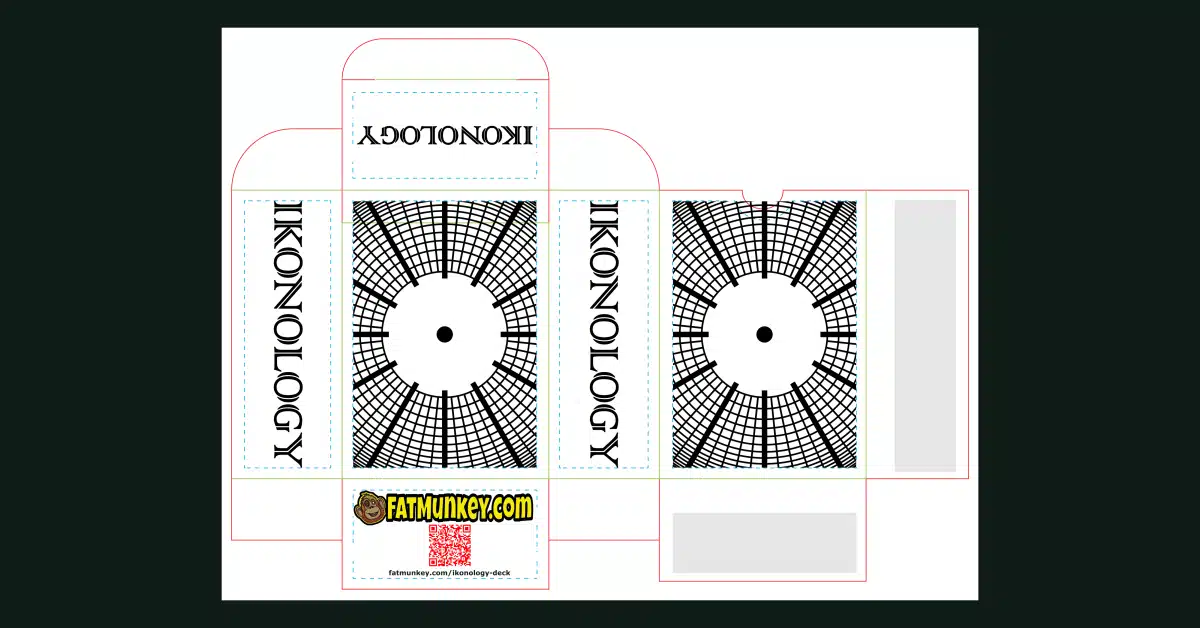
A snapshot of the Inkscape design document for the cardbord tuck box, unfolded of course.
Every card in this deck is built as vector art, full stop — no photography, no painted textures, no raster shortcuts. That was non-negotiable given the whole "icon" premise; icons live and die by clean, scalable geometry.
The very first draft of this deck goes back years, and I built it in Adobe Illustrator at the time. The version that's actually published now — the one you can hold in your hands — was reworked and finished in Inkscape. I'll be straightforward about why: Illustrator is genuinely good software, and I'm not pretending otherwise. But I'm done shoveling money at Adobe's subscription model for tools that free, capable alternatives can handle just as well for a project like this. Inkscape got the job done, and it didn't need a monthly bill to do it.
The Physical Product
The minimalist, modern-icon aesthetic doesn't stop at the card faces — it runs all the way through the packaging.
The tuck box carries the same radial, sunburst-style grid pattern as the rest of the deck: clean black linework on white, spokes radiating out from a center point. It's not decoration for decoration's sake. It's the same visual language as the cards, carried onto the box that holds them, so the whole object feels like one coherent design instead of cards-plus-generic-packaging.
The card backs take that radial pattern somewhere more specific, though. The back design is built on the structure of a clock face — sixty lines radiating from the center, with twelve of them drawn heavier than the rest to mark the hour positions. That's not an arbitrary aesthetic choice either. Tarot has always doubled as an oracle practice, and an oracle practice is fundamentally about time — about a moment, a question asked now, an answer that means something in the context of when it's drawn. Building the card back around a literal clock face ties that relationship directly into the object itself, before a single card is even turned face-up.
The deck ships with a 40-page companion booklet, and I kept it intentionally lean rather than exhaustive. It covers the Major Arcana (pages 4–11), the Minor Arcana (pages 12–30), a section on reading the cards and basic spreads (pages 31–33), the solitaire rules (pages 34–36, more on that game below), a page dedicated specifically to the hidden 52-card poker deck (page 37), and a closing section about the deck itself (page 38). It's meant to get you playing and reading quickly, not to replace a lifetime of oracle study — so the last page includes a QR code linking out to a fuller, more detailed guide online. The physical booklet and the website are meant to work together, not duplicate each other.
What's Next
Ikonology isn't the end of this — it's the first card project, not the only one.
I'm already working on a second deck, and this one leans all the way into the poker side of what Ikonology hinted at: a money-themed poker deck, built around wealth, wagers, and the whole psychology of the game. I'm keeping the actual name under wraps for now, mostly because it's still in flux and I'd rather not announce something I end up changing in two weeks. But it's coming, and if Ikonology is any indication of how much thought goes into these designs before a single card gets printed, it's worth keeping an eye out for.
Where to Get Ikonology
Ikonology will be available for purchase through The Game Crafter — $53.99 gets you the full 78-card deck and the 40-page booklet, packaged together in the tuck box described above. You can see more at fatmunkey.com/ikonology-deck.
If you've ever looked at a traditional tarot deck and loved it but wished someone would ask a genuinely different question of the form, this one's for you. And if you're more of a poker person who just wandered in — stick around. There's a deck hiding inside this deck with your name on it too.
Check Out FatMunkey's Books
FatMunkey has a huge selection of sudoku and other puzzle books you are sure to enjoy.
Have look at this post to see all of the books and read about what FatMunkey has published so far.